Many modern web pages limit the width of the page to allow for easier reading. Newspaper columns are narrow for the same reason.

You can intersperse text and images, if you are a bit careful how they flow around each other.

Text can go on the right of images too.
We use "clear:both;" to stop text spilling around pictures when we've finished..
Items can be centred.
The main text here continues on the left, and meanwhile something exciting is happening to our right.
There are hundreds of different tags and styles you can use to lay out pages. We've only scratched the surface here.
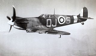
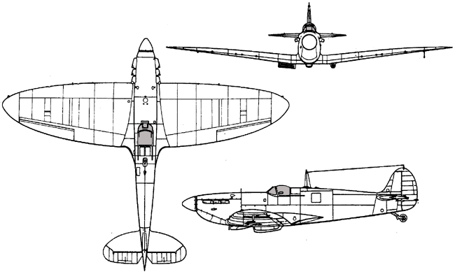
Original images: 15_Supermarine_Spitfire_R6923,_QJ-S.jpg (no known copyright restrictions), and Supermarine_Spitfire_3D_ExCC.gif (Public Domain)